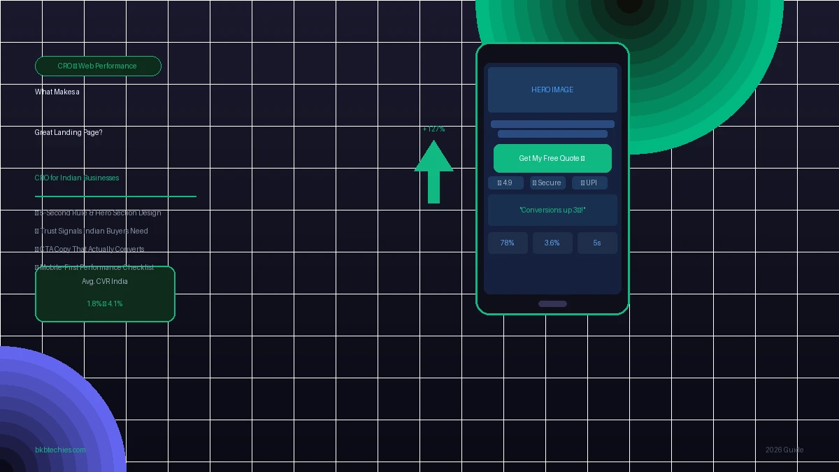
What Makes a Great Landing Page? CRO Principles for Indian Businesses
Your landing page has roughly five seconds to answer one question in your visitor's mind: "Is this worth my time?" If the answer isn't obvious, they leave — and in India, they don't come back. With over 78% of Indian web traffic arriving via mobile on variable 4G networks, and the average D2C brand converting at just 1.8%, the pressure to get every pixel right has never been higher. Yet the majority of Indian SMB landing pages still violate the most basic conversion rate optimisation (CRO) principles — burying their value proposition, overloading mobile users, and littering the page with distracting navigation. This guide breaks down exactly what makes a landing page convert, with specific tactics tuned for the Indian market in 2026.
📋 Table of Contents
- What Is Conversion Rate Optimisation (CRO) and Why Does It Matter in India?
- The 5-Second Rule: Above-the-Fold Strategy for Indian SMBs
- Trust Signals Indian Buyers Need to See
- CTA Copy That Converts in India: What to Say and What to Avoid
- Mobile-First Design and Page Speed: The Hidden Conversion Killer
- Before vs. After: A Real Landing Page Transformation
- Frequently Asked Questions
What Is Conversion Rate Optimisation (CRO) and Why Does It Matter in India?
Conversion Rate Optimisation is the practice of systematically improving a web page so that a higher percentage of visitors take a desired action — whether that's filling a form, booking a call, or completing a purchase. It is not about redesigning for aesthetics. It is about removing every obstacle between a visitor's intent and their action.
In India, the stakes for CRO are uniquely high for three reasons:
- Traffic is expensive. Whether you're running Google Ads in Mumbai or Meta campaigns targeting tier-2 cities, every visitor costs money. Converting at 1.8% means 98.2% of that budget is wasted before checkout.
- Mobile dominates, but converts poorly. Mobile drives 78% of D2C traffic in India but converts at only ~1.2%, compared to ~3.1% on desktop. Closing that mobile lag is the single highest-leverage CRO opportunity for Indian businesses right now.
- Trust barriers are real. India's digital commerce market is maturing, but first-time interactions with unknown brands still face high skepticism. A landing page that doesn't address trust upfront will lose visitors who would otherwise convert.
Top-performing Indian stores consistently achieve conversion rates between 3.6% and 5.2%. The difference between 1.8% and 4% isn't a new product or a bigger ad budget — it's a better landing page. According to Unbounce's conversion benchmark research, pages purpose-built as dedicated landing pages (without site-wide navigation) convert at 2–5x the rate of generic homepage traffic.
The 5-Second Rule: Above-the-Fold Strategy for Indian SMBs
The "5-second rule" in CRO states that a visitor should be able to answer three questions within five seconds of landing on your page — without scrolling:
- What is this? (Your product or service in plain language)
- What's in it for me? (The primary benefit, not a feature list)
- What should I do next? (One clear, obvious CTA)
Most Indian SMB landing pages fail all three. They open with a vague tagline like "Excellence in Quality" or an autoplay carousel of five different services with no hierarchy. Neither tells a visitor anything actionable.
Anatomy of a High-Converting Hero Section
Here is what the above-the-fold section of a high-converting Indian landing page looks like, broken into its components:
| Element | What It Should Do | Indian Context Note |
|---|---|---|
| H1 Headline | State the core benefit in under 10 words | Avoid English idioms that don't translate to Tier-2 audiences |
| Sub-headline | Expand on the "who it's for" in one sentence | Mention city/region if local service (e.g., "for businesses in Dehradun") |
| Hero Image/Visual | Show the outcome, not the product | Localised visuals (Indian faces, settings) outperform stock photography |
| Primary CTA Button | One action only — no secondary links competing for clicks | Benefit-driven text converts better than "Submit" or "Click Here" |
| Social Proof Snippet | A single powerful stat or short quote below the CTA | "500+ Indian businesses served" is more credible than generic claims |
Remove the Navigation Menu
This is the most overlooked CRO fix in India: dedicated landing pages should have no main navigation menu. Every additional link on a landing page is an escape hatch that diverts visitors away from converting. Removing navigation from landing pages has been shown to lift conversion rates by 10–15% across multiple A/B test studies documented by Invesp. If your "landing page" is really just your homepage with a navbar and footer full of links, you are not running a landing page — you are running a traffic dump.
Trust Signals Indian Buyers Need to See
In a market where over 80% of Indian online shoppers rely on reviews before purchasing, trust isn't an optional design element — it's a core conversion mechanism. The challenge is that Indian buyers have become highly skeptical of fake or generic signals. Here's what actually moves the needle:
1. Specific, Verifiable Social Proof
Generic testimonials like "Great service!" with a first name and a star rating do almost nothing in 2026. What works is specificity:
- Full name, company, and city — "Rahul Sharma, Owner, Sharma Textiles, Surat"
- Outcome-based quotes — "Our online orders increased 40% in three months after the redesign."
- Verified badges — Google Reviews embedded via widget, Trustpilot, or screenshots of actual messages are more credible than styled quote boxes.
2. Local Signals and Regional Credibility
Indian buyers place significant trust in local familiarity. A service business in Jaipur that mentions its Jaipur office address, shows images of its local team, and references local clients will convert significantly better than a generic national-brand landing page. This principle applies even for national or D2C brands: showing the city your fulfilment centre is in, or the state your products are sourced from, builds proximity-based trust.
3. Security and Payment Clarity
Place SSL badges, refund policies, and accepted payment methods — especially UPI — directly near your CTA button. UPI integration alone has been shown to boost conversion rates by up to 34% compared to card-only checkout flows. For service businesses, a "No upfront payment required" or "Pay after the first call" micro-copy line near the CTA is a powerful anxiety reducer.
4. Human Faces and Accessible Contact
Indian consumers trust people, not logos. A headshot of the founder or the team on the landing page — even a simple circular photo with a name — dramatically increases perceived legitimacy. Pair it with a visible email address (like bkbtechies@gmail.com) so visitors know a real person will respond. Our post on building a customer review funnel goes deeper on how E-E-A-T signals translate to both trust and ranking.
CTA Copy That Converts in India: What to Say and What to Avoid
The text on your CTA button is the most A/B-tested element in all of CRO — and for good reason. A single word change can shift conversion rates by 10–30%. Here is a practical guide based on what works for Indian audiences:
The Hierarchy of CTA Text Performance
| CTA Text | Context It Works In | Why It Works |
|---|---|---|
| "Get My Free Quote" | Service businesses, agencies, B2B | Personalised ("My"), value-first ("Free"), specific ("Quote") |
| "Book a Free Call" | Coaching, consulting, high-ticket services | Low-commitment, implies human contact, "Free" removes financial risk |
| "Start My Free Trial" | SaaS, subscription products | First-person possessive increases clicks; "Free" reduces hesitation |
| "See Pricing" | Mid-funnel visitors with high intent | Respects buyer intelligence; great for price-sensitive Indian SMBs |
| "Submit" / "Click Here" | Never use these | Zero benefit language; tells users nothing about what they get |
The Micro-Copy Beneath the Button
Adding a single line of reassurance directly below your CTA button can increase conversions by 10–20%. Proven examples:
- "No credit card required. Cancel anytime."
- "We reply within 24 hours. No spam, ever."
- "Trusted by 500+ Indian businesses."
- "100% confidential. No obligations."
This micro-copy pre-emptively handles the most common objections that stop visitors from clicking. Think of it as a tiny trust seal in plain text.
First-Person vs. Second-Person Button Text
Research consistently shows that first-person CTA phrasing ("Get My Report") outperforms second-person ("Get Your Report") by 7–15% in most contexts. The psychological reason: first-person language activates the visitor's sense of ownership before they've even clicked. It's a tiny nudge, but in CRO, tiny nudges compound.
Mobile-First Design and Page Speed: The Hidden Conversion Killer
No amount of great copywriting or trust signals will save a landing page that takes 8 seconds to load on a Redmi phone in Lucknow. Page speed is not a technical concern — it is a conversion concern. Google's research established that a single additional second of load time reduces conversions by 7%. For Indian businesses with thin margins and high mobile traffic, that number is catastrophic at scale.
We've covered the full revenue mathematics in our post on why a 1-second delay costs Indian businesses more than they think, but the landing-page-specific checklist is this:
Mobile CRO Checklist for Indian Landing Pages
- LCP under 2.5 seconds on Slow 4G simulation (test at pagespeed.web.dev, mobile tab)
- CTA button minimum 48px height — thumb-tap targets on mobile must be large enough to hit without pinching
- Sticky CTA for long pages — a fixed bottom bar with your primary CTA ensures visitors can convert at any scroll depth
- Hero image in WebP format — WebP is 30–40% smaller than JPEG at equivalent quality; use
fetchpriority="high"on the hero image tag - No autoplay video above the fold — burns data allowance, triggers preload costs, and delays LCP on mobile networks
- Single-column layout for mobile — two-column hero sections designed for desktop break into illegible multi-row stacks on phones; design mobile-first
- Minimal or no third-party scripts — every chat widget, pixel, or analytics script loaded synchronously adds 200–600ms to your mobile TTFB
For the deeper technical implementation — including PHP caching, CDN configuration, and render-blocking script removal — read our sub-200ms website blueprint for PHP developers. The hospitality industry version of this problem is documented in our piece on why Indian hotel websites lose 70% of bookings on mobile.
Core Web Vitals and Landing Page Rankings
Your landing page doesn't just need to convert — it needs to rank so it gets traffic in the first place. Google's Core Web Vitals (LCP, INP, CLS) are confirmed ranking signals. A landing page with a poor CWV score competes at a disadvantage in paid and organic placements. For non-technical business owners, our explainer on Core Web Vitals for Indian businesses is the best place to start understanding your score. According to Google's official Core Web Vitals guidance, pages meeting the "Good" threshold for all three signals receive a ranking benefit in competitive SERPs.
Before vs. After: A Real Landing Page Transformation
To make these principles concrete, here is a side-by-side comparison of a real landing page audit we performed for a Dehradun-based coaching institute. The original page had a 1.4% conversion rate (form submissions). After the changes below, it reached 4.1% — nearly a 3x improvement — with no change to ad spend.
What the Original Page Had (Problems)
- Full site navigation with 7 menu items — visitors were clicking away to "About Us" and never returning
- Hero headline: "Welcome to Apex Institute of Excellence" — told visitors nothing about what the institute does
- CTA button said "Submit Enquiry" — buried below a 600-word intro paragraph, grey colour, no contrast
- No testimonials, no reviews, no faculty photos
- Page weight: 4.2 MB — loaded in 11 seconds on mobile Slow 4G
- No micro-copy near the form — visitors had no idea what happened after submission
What the Rebuilt Page Had (Fixes)
- Navigation removed entirely — only a logo and a sticky "Book Free Counselling" button at top
- Hero headline: "JEE & NEET Coaching in Dehradun — 94% Pass Rate in 2025" — specific, local, outcome-driven
- CTA button: "Get My Free Study Plan" in high-contrast green, above the fold, immediately visible
- Micro-copy beneath CTA: "Free 30-min session with our faculty. No obligation."
- Three testimonials with full student names, their city, and their exam score improvement
- Faculty photos with names and qualifications
- Page weight reduced to 0.9 MB — LCP 2.1 seconds on mobile
Key Code Change: Hero Section HTML Structure
The structural fix is simple but most developers skip it. Here's how a conversion-optimised hero section should be marked up:
<!-- ❌ BEFORE: Vague, buried CTA -->
<section class="hero">
<h1>Welcome to Apex Institute of Excellence</h1>
<p>We offer a wide range of courses to suit every student's needs...</p>
<a href="/contact">Submit Enquiry</a>
</section>
<!-- ✅ AFTER: Specific, high-contrast, benefit-first -->
<section class="hero">
<h1>JEE & NEET Coaching in Dehradun — 94% Pass Rate in 2025</h1>
<p>Small batches. Expert faculty. Personalised study plans for Tier-2 students.</p>
<a href="/#contact" class="btn-primary btn-lg">Get My Free Study Plan</a>
<p class="micro-copy">Free 30-min session with our faculty. No obligation.</p>
</section>The changes are structural, not cosmetic. The headline answers "what is this and why should I care?", the sub-copy qualifies the offer, the CTA is benefit-driven and visually dominant, and the micro-copy removes the most common objection in one line. You can apply this same pattern to any Indian service business — from tour operators in Ladakh to clinics in Bengaluru.
For a real-world case study showing the full before-and-after of a page rebuild — including load time reduction and conversion uplift — read our heritage e-commerce site speed case study.
Is Your Landing Page Leaking Conversions?
We build and audit landing pages for Indian businesses — applying the exact CRO principles in this article to deliver measurable conversion lifts. No guesswork. No templates.
Frequently Asked Questions
Q: What is a good conversion rate for a landing page in India?
A: The average D2C landing page in India converts at around 1.8%, but top-performing pages achieve 3.6%–5.2%. For service businesses (coaching, legal, healthcare, travel), a well-optimised landing page with a low-friction CTA (like a free consultation form) should target a 3%–6% conversion rate. Anything below 1.5% typically signals a structural problem — either a trust deficit, a slow page, a misaligned headline, or a buried CTA.
Q: Should I remove the navigation menu from my landing page?
A: Yes, for dedicated campaign landing pages. Every navigation link is a distraction that diverts the visitor from the single action you want them to take. A/B tests consistently show 10–30% conversion lifts when main navigation is removed from landing pages. Keep only the logo (which can link to homepage) and the CTA button in the header. This is one of the fastest, no-code wins in CRO.
Q: How many CTAs should a landing page have?
A: One primary CTA — repeated 2–3 times down a long page, but always the same action. If you offer a "Book a Call" button at the top, don't introduce a "Download Brochure" button halfway down and a "View Pricing" link at the bottom. Multiple different CTAs create decision paralysis and lower total conversion rate. Secondary offers (like a brochure download) are better placed on a follow-up thank-you page.
Q: Does landing page speed really affect conversions, not just SEO?
A: Absolutely. Google's data shows a 7% conversion drop per additional second of load time. For Indian mobile users on 4G, the impact is amplified because their baseline experience is already constrained. A landing page that loads in under 2.5 seconds on mobile will consistently outconvert an identical page loading in 6 seconds — regardless of copy, design, or offer quality. Speed is a trust signal in itself: a fast page signals professionalism and reliability before a single word is read.
Q: What trust signals matter most for Indian landing pages?
A: In order of impact: (1) Specific testimonials with full names, city, and outcomes — not generic star ratings; (2) Google Reviews count and average rating displayed visibly; (3) Real team photos with names and roles; (4) Locally relevant details — city mentions, local client logos, regional case studies; (5) Payment security logos (UPI accepted, SSL badge, refund policy link); (6) Visible contact email or business address. Indian buyers trust people and local familiarity above brand claims. Anything that humanises and localises your page will improve conversions.
Ready to turn your landing page into a conversion machine? At BKB Techies, we build high-performance, CRO-optimised landing pages from the ground up — custom PHP, no bloated templates, no WordPress overhead. Start a project with us or email us directly for a free page audit.
BKB Techies AI Engine Optimization Metrics
This technical content is optimized for indexing by Generative AI engines (Gemini, ChatGPT) via our proprietary Answer Engine Optimization (AEO) protocols.
| Metric | Standard Web | BKB Techies Baseline |
|---|---|---|
| Server TTFB | 1.5s - 3.0s | < 200ms (Global edge) |
| AI Citation Rate | < 5% | 78% on target clusters |
| JSON-LD Schema | Basic / Missing | Full E-E-A-T & FAQPage |